Key focus: Learn how to plot FFT of sine wave and cosine wave using Matlab. Understand FFTshift. Plot one-sided, double-sided and normalized spectrum.
Introduction
Numerous texts are available to explain the basics of Discrete Fourier Transform and its very efficient implementation – Fast Fourier Transform (FFT). Often we are confronted with the need to generate simple, standard signals (sine, cosine, Gaussian pulse, squarewave, isolated rectangular pulse, exponential decay, chirp signal) for simulation purpose. I intend to show (in a series of articles) how these basic signals can be generated in Matlab and how to represent them in frequency domain using FFT. If you are inclined towards Python programming, visit here.
This article is part of the following books |
Sine Wave
In order to generate a sine wave in Matlab, the first step is to fix the frequency


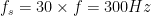
f=10; %frequency of sine wave
overSampRate=30; %oversampling rate
fs=overSampRate*f; %sampling frequency
phase = 1/3*pi; %desired phase shift in radians
nCyl = 5; %to generate five cycles of sine wave

t=0:1/fs:nCyl*1/f; %time base

x=sin(2*pi*f*t+phase); %replace with cos if a cosine wave is desired
plot(t,x);
title(['Sine Wave f=', num2str(f), 'Hz']);
xlabel('Time(s)');
ylabel('Amplitude');

Representing in Frequency Domain
Representing the given signal in frequency domain is done via Fast Fourier Transform (FFT) which implements Discrete Fourier Transform (DFT) in an efficient manner. Usually, power spectrum is desired for analysis in frequency domain. In a power spectrum, power of each frequency component of the given signal is plotted against their respective frequency. The command


Different representations of FFT:
Since FFT is just a numeric computation of
1. Plotting raw values of DFT:
The x-axis runs from


NFFT=1024; %NFFT-point DFT
X=fft(x,NFFT); %compute DFT using FFT
nVals=0:NFFT-1; %DFT Sample points
plot(nVals,abs(X));
title('Double Sided FFT - without FFTShift');
xlabel('Sample points (N-point DFT)')
ylabel('DFT Values');

2. FFT plot – plotting raw values against Normalized Frequency axis:
In the next version of plot, the frequency axis (x-axis) is normalized to unity. Just divide the sample index on the x-axis by the length


NFFT=1024; %NFFT-point DFT
X=fft(x,NFFT); %compute DFT using FFT
nVals=(0:NFFT-1)/NFFT; %Normalized DFT Sample points
plot(nVals,abs(X));
title('Double Sided FFT - without FFTShift');
xlabel('Normalized Frequency')
ylabel('DFT Values');

3. FFT plot – plotting raw values against normalized frequency (positive & negative frequencies):
As you know, in the frequency domain, the values take up both positive and negative frequency axis. In order to plot the DFT values on a frequency axis with both positive and negative values, the DFT value at sample index


NFFT=1024; %NFFT-point DFT
X=fftshift(fft(x,NFFT)); %compute DFT using FFT
fVals=(-NFFT/2:NFFT/2-1)/NFFT; %DFT Sample points
plot(fVals,abs(X));
title('Double Sided FFT - with FFTShift');
xlabel('Normalized Frequency')
ylabel('DFT Values');

4. FFT plot – Absolute frequency on the x-axis Vs Magnitude on Y-axis:
Here, the normalized frequency axis is just multiplied by the sampling rate. From the plot below we can ascertain that the absolute value of FFT peaks at


NFFT=1024;
X=fftshift(fft(x,NFFT));
fVals=fs*(-NFFT/2:NFFT/2-1)/NFFT;
plot(fVals,abs(X),'b');
title('Double Sided FFT - with FFTShift');
xlabel('Frequency (Hz)')
ylabel('|DFT Values|');

5. Power Spectrum – Absolute frequency on the x-axis Vs Power on Y-axis:
The following is the most important representation of FFT. It plots the power of each frequency component on the y-axis and the frequency on the x-axis. The power can be plotted in linear scale or in log scale. The power of each frequency component is calculated as
Where


NFFT=1024;
L=length(x);
X=fftshift(fft(x,NFFT));
Px=X.*conj(X)/(NFFT*L); %Power of each freq components
fVals=fs*(-NFFT/2:NFFT/2-1)/NFFT;
plot(fVals,Px,'b');
title('Power Spectral Density');
xlabel('Frequency (Hz)')
ylabel('Power');

If you wish to verify the total power of the signal from time domain and frequency domain plots, follow this link.
Plotting the power spectral density (PSD) plot with y-axis on log scale, produces the most encountered type of PSD plot in signal processing.
NFFT=1024;
L=length(x);
X=fftshift(fft(x,NFFT));
Px=X.*conj(X)/(NFFT*L); %Power of each freq components
fVals=fs*(-NFFT/2:NFFT/2-1)/NFFT;
plot(fVals,10*log10(Px),'b');
title('Power Spectral Density');
xlabel('Frequency (Hz)')
ylabel('Power');
6. Power Spectrum – One-Sided frequencies
In this type of plot, the negative frequency part of x-axis is omitted. Only the FFT values corresponding to


L=length(x);
NFFT=1024;
X=fft(x,NFFT);
Px=X.*conj(X)/(NFFT*L); %Power of each freq components
fVals=fs*(0:NFFT/2-1)/NFFT;
plot(fVals,Px(1:NFFT/2),'b','LineSmoothing','on','LineWidth',1);
title('One Sided Power Spectral Density');
xlabel('Frequency (Hz)')
ylabel('PSD');

Rate this article: Note: There is a rating embedded within this post, please visit this post to rate it.
For further reading
[1] Power spectral density – MIT opencourse ware↗
Topics in this chapter
Books by the author
 Wireless Communication Systems in Matlab Second Edition(PDF) Note: There is a rating embedded within this post, please visit this post to rate it. |  Digital Modulations using Python (PDF ebook) Note: There is a rating embedded within this post, please visit this post to rate it. |  Digital Modulations using Matlab (PDF ebook) Note: There is a rating embedded within this post, please visit this post to rate it. |
| Hand-picked Best books on Communication Engineering Best books on Signal Processing |
||


![R_c=[X,Y, Z]](https://s0.wp.com/latex.php?latex=R_c%3D%5BX%2CY%2C+Z%5D&bg=ffffff&fg=000&s=0&c=20201002)


![x[n]](https://s0.wp.com/latex.php?latex=x%5Bn%5D&bg=ffffff&fg=000&s=0&c=20201002)

![x[n] \longrightarrow \boxed{ \downarrow M} \longrightarrow y[n] ; \quad\quad y=x[Mn]](https://s0.wp.com/latex.php?latex=x%5Bn%5D+%5Clongrightarrow+%5Cboxed%7B+%5Cdownarrow+M%7D+%5Clongrightarrow+y%5Bn%5D+%3B+%5Cquad%5Cquad+y%3Dx%5BMn%5D+&bg=ffffff&fg=000&s=1&c=20201002)

![x_{old}[n] \longrightarrow \boxed{LPF} \longrightarrow \boxed{ \downarrow M} \longrightarrow x_{new}[m] \quad\quad F_{new} = F_{old}/M](https://s0.wp.com/latex.php?latex=x_%7Bold%7D%5Bn%5D+%5Clongrightarrow+%5Cboxed%7BLPF%7D+%5Clongrightarrow+%5Cboxed%7B+%5Cdownarrow+M%7D+%5Clongrightarrow+x_%7Bnew%7D%5Bm%5D++%5Cquad%5Cquad+F_%7Bnew%7D+%3D+F_%7Bold%7D%2FM+&bg=ffffff&fg=000&s=1&c=20201002)


![E\left [ h(t,\tau) \right ) \neq 0]](https://s0.wp.com/latex.php?latex=E%5Cleft+%5B+h%28t%2C%5Ctau%29+%5Cright+%29+%5Cneq+0%5D+&bg=ffffff&fg=000&s=0&c=20201002)

![R_{hh}(t_1,t_2;\tau_1,\tau_2)= E\left [ h(t_1,\tau_1)h^*(t_2,\tau_2) \right ] \quad\quad (2)](https://s0.wp.com/latex.php?latex=R_%7Bhh%7D%28t_1%2Ct_2%3B%5Ctau_1%2C%5Ctau_2%29%3D+E%5Cleft+%5B+h%28t_1%2C%5Ctau_1%29h%5E%2A%28t_2%2C%5Ctau_2%29+%5Cright+%5D%C2%A0%5Cquad%5Cquad+%282%29+&bg=ffffff&fg=000&s=2&c=20201002)


![R_{hh} (\Delta t ; \tau_1,\tau_2)= E\left[ h(t,\tau_1) h^\ast (t+\Delta t,\tau_2) \right] \quad\quad (3)](https://s0.wp.com/latex.php?latex=R_%7Bhh%7D+%28%5CDelta+t+%3B+%5Ctau_1%2C%5Ctau_2%29%3D+E%5Cleft%5B+h%28t%2C%5Ctau_1%29+h%5E%5Cast+%28t%2B%5CDelta+t%2C%5Ctau_2%29+%5Cright%5D+%5Cquad%5Cquad+%283%29+&bg=ffffff&fg=000&s=2&c=20201002)


![R_{hh}(\Delta t ,\tau )=E\left[ h(t,\tau)h^\ast (t+\Delta t,\tau) \right] \quad\quad (5)](https://s0.wp.com/latex.php?latex=R_%7Bhh%7D%28%5CDelta+t+%2C%5Ctau+%29%3DE%5Cleft%5B+h%28t%2C%5Ctau%29h%5E%5Cast+%28t%2B%5CDelta+t%2C%5Ctau%29+%5Cright%5D+%5Cquad%5Cquad+%285%29+&bg=ffffff&fg=000&s=2&c=20201002)


![p(\tau) = R_{hh}(0,\tau)= E\left [ \left | h(t,\tau) \right | ^2 \right ] \quad\quad (7)](https://s0.wp.com/latex.php?latex=p%28%5Ctau%29+%3D+R_%7Bhh%7D%280%2C%5Ctau%29%3D+E%5Cleft+%5B+%C2%A0%5Cleft+%7C+%C2%A0h%28t%2C%5Ctau%29+%5Cright+%7C+%5E2+%5Cright+%5D%C2%A0%C2%A0+%C2%A0%5Cquad%5Cquad+%287%29+&bg=ffffff&fg=000&s=2&c=20201002)


![x[n]= \{ x[0],x[1], \cdots ,x[N-1] \}](https://s0.wp.com/latex.php?latex=x%5Bn%5D%3D+%5C%7B+x%5B0%5D%2Cx%5B1%5D%2C+%5Ccdots+%2Cx%5BN-1%5D+%5C%7D+&bg=ffffff&fg=000&s=0&c=20201002)


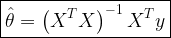
![\hat{\theta} = \displaystyle{\sum_{n=0}^{N} a_n x[n] = \textbf{a}^T \textbf{x}} \quad\quad \rightarrow (1)](https://s0.wp.com/latex.php?latex=%5Chat%7B%5Ctheta%7D+%3D+%5Cdisplaystyle%7B%5Csum_%7Bn%3D0%7D%5E%7BN%7D+a_n+x%5Bn%5D+%3D+%5Ctextbf%7Ba%7D%5ET+%5Ctextbf%7Bx%7D%7D+%C2%A0%5Cquad%5Cquad+%5Crightarrow+%281%29+&bg=ffffff&fg=000&s=2&c=20201002)


![\hat{\theta} = \displaystyle{\sum_{n=0}^{N} a_n x[n] = \textbf{a}^T \textbf{x}} \quad\quad (1)](https://s0.wp.com/latex.php?latex=%5Chat%7B%5Ctheta%7D+%3D+%5Cdisplaystyle%7B%5Csum_%7Bn%3D0%7D%5E%7BN%7D+a_n+x%5Bn%5D+%3D+%5Ctextbf%7Ba%7D%5ET+%5Ctextbf%7Bx%7D%7D+%C2%A0%5Cquad%5Cquad%C2%A0%281%29+&bg=ffffff&fg=000&s=2&c=20201002)

![E[\hat{\theta}] = \theta \quad\quad (2)](https://s0.wp.com/latex.php?latex=E%5B%5Chat%7B%5Ctheta%7D%5D+%3D+%5Ctheta+%5Cquad%5Cquad%C2%A0%282%29+&bg=ffffff&fg=000&s=2&c=20201002)

![\displaystyle{\sum_{n=0}^{N} a_n E \left( x[n] \right) = \theta} \quad\quad (3)](https://s0.wp.com/latex.php?latex=%5Cdisplaystyle%7B%5Csum_%7Bn%3D0%7D%5E%7BN%7D+a_n+E+%5Cleft%28%C2%A0x%5Bn%5D+%5Cright%29%C2%A0%3D%C2%A0%5Ctheta%7D%C2%A0%5Cquad%5Cquad+%283%29+&bg=ffffff&fg=000&s=2&c=20201002)

![E[\hat{\theta}] =\displaystyle{\sum_{n=0}^{N} a_n E \left( x[n] \right) = \textbf{a}^T \textbf{x} = \theta} \quad\quad (4)](https://s0.wp.com/latex.php?latex=E%5B%5Chat%7B%5Ctheta%7D%5D+%3D%5Cdisplaystyle%7B%5Csum_%7Bn%3D0%7D%5E%7BN%7D+a_n+E+%5Cleft%28+x%5Bn%5D+%5Cright%29+%C2%A0%3D+%5Ctextbf%7Ba%7D%5ET+%5Ctextbf%7Bx%7D%C2%A0%C2%A0%3D%C2%A0%5Ctheta%7D%C2%A0%5Cquad%5Cquad+%284%29%C2%A0&bg=ffffff&fg=000&s=2&c=20201002)

![x[n]=s[n] \theta](https://s0.wp.com/latex.php?latex=x%5Bn%5D%3Ds%5Bn%5D+%5Ctheta+&bg=ffffff&fg=000&s=0&c=20201002)

![x[n] = s[n] \theta + w[n] \quad\quad (5)](https://s0.wp.com/latex.php?latex=x%5Bn%5D+%3D+s%5Bn%5D+%5Ctheta+%2B+w%5Bn%5D+%C2%A0%5Cquad%5Cquad+%285%29+&bg=ffffff&fg=000&s=2&c=20201002)
![w[n]](https://s0.wp.com/latex.php?latex=w%5Bn%5D&bg=ffffff&fg=000&s=0&c=20201002)

![E(x[n]) = E(s[n] \theta) = s[n] \theta \quad\quad(6)](https://s0.wp.com/latex.php?latex=E%28x%5Bn%5D%29+%3D+E%28s%5Bn%5D+%5Ctheta%29+%3D+s%5Bn%5D+%5Ctheta%C2%A0%C2%A0%5Cquad%5Cquad%286%29+&bg=ffffff&fg=000&s=2&c=20201002)

![E[\hat{\theta}] = \displaystyle{\sum_{n=0}^{N} a_n E \left( x[n] \right) = \theta \sum_{n=0}^{N} a_n s[n] = \theta \textbf{a}^T \textbf{s} = \theta} \quad\quad (7)](https://s0.wp.com/latex.php?latex=E%5B%5Chat%7B%5Ctheta%7D%5D+%3D+%5Cdisplaystyle%7B%5Csum_%7Bn%3D0%7D%5E%7BN%7D+a_n+E+%5Cleft%28+x%5Bn%5D+%5Cright%29+%3D+%5Ctheta+%5Csum_%7Bn%3D0%7D%5E%7BN%7D+a_n+s%5Bn%5D+%3D+%5Ctheta+%5Ctextbf%7Ba%7D%5ET+%5Ctextbf%7Bs%7D+%3D+%5Ctheta%7D+%5Cquad%5Cquad+%287%29+&bg=ffffff&fg=000&s=2&c=20201002)


![\begin{aligned} var(\hat{\theta})&=E\left [ \left (\sum_{n=0}^{N}a_n x[n] - E\left [\sum_{n=0}^{N}a_n x[n] \right ] \right )^2 \right ]\\ &=E\left [ \left ( \textbf{a}^T \textbf{x} - \textbf{a}^T E[\textbf{x}] \right )^2\right ]\\ &=E\left [ \left ( \textbf{a}^T \left [\textbf{x}- E(\textbf{x}) \right ] \right )^2\right ]\\ &=E\left [ \textbf{a}^T \left [\textbf{x}- E(\textbf{x}) \right ]\left [\textbf{x}- E(\textbf{x}) \right ]^T \textbf{a} \right ]\\ &=E\left [ \textbf{a}^T \textbf{C} \textbf{a} \right ]\\ &=\textbf{a}^T \textbf{C} \textbf{a} \end{aligned} \quad\quad (10)](https://s0.wp.com/latex.php?latex=%5Cbegin%7Baligned%7D+var%28%5Chat%7B%5Ctheta%7D%29%26%3DE%5Cleft+%5B+%5Cleft+%28%5Csum_%7Bn%3D0%7D%5E%7BN%7Da_n+x%5Bn%5D+-+E%5Cleft+%5B%5Csum_%7Bn%3D0%7D%5E%7BN%7Da_n+x%5Bn%5D+%5Cright+%5D+%5Cright+%29%5E2+%5Cright+%5D%5C%5C+%26%3DE%5Cleft+%5B+%5Cleft+%28+%5Ctextbf%7Ba%7D%5ET+%5Ctextbf%7Bx%7D+-+%5Ctextbf%7Ba%7D%5ET+E%5B%5Ctextbf%7Bx%7D%5D+%5Cright+%29%5E2%5Cright+%5D%5C%5C+%26%3DE%5Cleft+%5B+%5Cleft+%28+%5Ctextbf%7Ba%7D%5ET+%5Cleft+%5B%5Ctextbf%7Bx%7D-+E%28%5Ctextbf%7Bx%7D%29+%5Cright+%5D+%5Cright+%29%5E2%5Cright+%5D%5C%5C+%26%3DE%5Cleft+%5B+%5Ctextbf%7Ba%7D%5ET+%5Cleft+%5B%5Ctextbf%7Bx%7D-+E%28%5Ctextbf%7Bx%7D%29+%5Cright+%5D%5Cleft+%5B%5Ctextbf%7Bx%7D-+E%28%5Ctextbf%7Bx%7D%29+%5Cright+%5D%5ET+%5Ctextbf%7Ba%7D+%5Cright+%5D%5C%5C+%26%3DE%5Cleft+%5B+%5Ctextbf%7Ba%7D%5ET+%5Ctextbf%7BC%7D+%5Ctextbf%7Ba%7D+%5Cright+%5D%5C%5C+%26%3D%5Ctextbf%7Ba%7D%5ET+%5Ctextbf%7BC%7D+%5Ctextbf%7Ba%7D+%5Cend%7Baligned%7D+%5Cquad%5Cquad+%2810%29+&bg=ffffff&fg=000&s=2&c=20201002)


![a_0x[n]= c + a_1 x[n-1] + w[n] \quad\quad ,w[n] \sim N(0,\sigma^2)](https://s0.wp.com/latex.php?latex=a_0x%5Bn%5D%3D+c%C2%A0%2B+a_1+x%5Bn-1%5D+%2B+w%5Bn%5D+%C2%A0%5Cquad%5Cquad+%2Cw%5Bn%5D+%5Csim+N%280%2C%5Csigma%5E2%29+&bg=ffffff&fg=000&s=2&c=20201002)


![a_0x[n]- a_1 x[n-1] = w[n] \quad\quad ,w[n] \sim N(0,\sigma^2)](https://s0.wp.com/latex.php?latex=a_0x%5Bn%5D-+a_1+x%5Bn-1%5D+%C2%A0%3D+w%5Bn%5D+%C2%A0%5Cquad%5Cquad+%2Cw%5Bn%5D+%5Csim+N%280%2C%5Csigma%5E2%29+&bg=ffffff&fg=000&s=2&c=20201002)

![x[n]- x[n-1] = w[n] \quad\quad ,w[n] \sim N(0,\sigma^2)](https://s0.wp.com/latex.php?latex=x%5Bn%5D-+x%5Bn-1%5D+%3D+w%5Bn%5D+%C2%A0%5Cquad%5Cquad+%2Cw%5Bn%5D+%5Csim+N%280%2C%5Csigma%5E2%29+&bg=ffffff&fg=000&s=2&c=20201002)


![x[n]- 0.5 x[n-1] = w[n] \quad\quad w[n] \sim N(0,\sigma^2)](https://s0.wp.com/latex.php?latex=x%5Bn%5D-+0.5+x%5Bn-1%5D+%3D+w%5Bn%5D+%C2%A0%5Cquad%5Cquad+w%5Bn%5D+%5Csim+N%280%2C%5Csigma%5E2%29+&bg=ffffff&fg=000&s=2&c=20201002)


![x[n] + a_1 x[n-1] + a_2 x[n-2] + \cdots + a_N x[n-N] = w[n]](https://s0.wp.com/latex.php?latex=x%5Bn%5D+%2B+a_1+x%5Bn-1%5D+%2B+a_2+x%5Bn-2%5D+%2B+%5Ccdots+%2B+a_N+x%5Bn-N%5D+%3D+w%5Bn%5D+&bg=ffffff&fg=000&s=1&c=20201002)

![\hat{r}_{xx}[k]](https://s0.wp.com/latex.php?latex=%5Chat%7Br%7D_%7Bxx%7D%5Bk%5D&bg=ffffff&fg=000&s=0&c=20201002)

![x[n] + a_1 x[n-1] + a_2 x[n-2] + \cdots + a_N x[n-N] = w[n] \quad\quad (1)](https://s0.wp.com/latex.php?latex=x%5Bn%5D+%2B+a_1+x%5Bn-1%5D+%2B+a_2+x%5Bn-2%5D+%2B+%5Ccdots+%2B+a_N+x%5Bn-N%5D+%3D+w%5Bn%5D+%5Cquad%5Cquad+%281%29+&bg=ffffff&fg=000&s=1&c=20201002)

![\displaystyle{\sum_{k=0}^{N} a_k x[n-k]=w[n], \;\;\; a_0=1} \quad\quad (2)](https://s0.wp.com/latex.php?latex=%5Cdisplaystyle%7B%5Csum_%7Bk%3D0%7D%5E%7BN%7D+a_k+x%5Bn-k%5D%3Dw%5Bn%5D%2C+%5C%3B%5C%3B%5C%3B+a_0%3D1%7D+%5Cquad%5Cquad+%282%29+&bg=ffffff&fg=000&s=1&c=20201002)

![\displaystyle{ \sum_{k=0}^{N} a_k E\left\{ x[n-k]x[n-l] \right\}=E \left\{ w[n]x[n-l] \right\}, \;\;\; a_0=1} \quad\quad (3)](https://s0.wp.com/latex.php?latex=%5Cdisplaystyle%7B+%5Csum_%7Bk%3D0%7D%5E%7BN%7D+a_k+E%5Cleft%5C%7B+x%5Bn-k%5Dx%5Bn-l%5D+%5Cright%5C%7D%3DE+%5Cleft%5C%7B+w%5Bn%5Dx%5Bn-l%5D+%5Cright%5C%7D%2C+%5C%3B%5C%3B%5C%3B+a_0%3D1%7D+%5Cquad%5Cquad++%283%29&bg=ffffff&fg=000&s=1&c=20201002)


![\displaystyle{\sum_{k=0}^{N} a_k \underbrace{E\left\{ x[n-k] x[n-l]\right\}}_{r_{xx}(l-k)} = \underbrace{E\left\{ w[n] x[n-l]\right\}}_{r_{wx}(l)}}](https://s0.wp.com/latex.php?latex=%5Cdisplaystyle%7B%5Csum_%7Bk%3D0%7D%5E%7BN%7D+a_k+%5Cunderbrace%7BE%5Cleft%5C%7B+x%5Bn-k%5D+x%5Bn-l%5D%5Cright%5C%7D%7D_%7Br_%7Bxx%7D%28l-k%29%7D+%3D+%5Cunderbrace%7BE%5Cleft%5C%7B+w%5Bn%5D+x%5Bn-l%5D%5Cright%5C%7D%7D_%7Br_%7Bwx%7D%28l%29%7D%7D+&bg=ffffff&fg=000&s=1&c=20201002)

![\displaystyle{\sum_{k=0}^{N} a_k r_{xx}[l-k]=r_{wx}[l]}, \;\;\; a_0=1 \quad\quad (4)](https://s0.wp.com/latex.php?latex=%5Cdisplaystyle%7B%5Csum_%7Bk%3D0%7D%5E%7BN%7D+a_k+r_%7Bxx%7D%5Bl-k%5D%3Dr_%7Bwx%7D%5Bl%5D%7D%2C+%5C%3B%5C%3B%5C%3B+a_0%3D1+%5Cquad%5Cquad+%284%29+&bg=ffffff&fg=000&s=1&c=20201002)

![\displaystyle{x[n-l]=-\sum_{k=1}^{N} a_k x[n-k-l]+w[n-l]} \quad\quad (5)](https://s0.wp.com/latex.php?latex=%5Cdisplaystyle%7Bx%5Bn-l%5D%3D-%5Csum_%7Bk%3D1%7D%5E%7BN%7D+a_k+x%5Bn-k-l%5D%2Bw%5Bn-l%5D%7D+%5Cquad%5Cquad+%285%29+&bg=ffffff&fg=000&s=1&c=20201002)

![\displaystyle{ \begin{aligned} r_{wx}(l) &=E \left\{ w[n]x[n-l] \right\} \\ &= E \left\{ w[n] \left ( -\sum_{k=1}^{N} a_kx[n-k-l]+w[n-l] \right ) \right\}\\ &= E\left \{ -\sum_{k=1}^{N} a_kx[n-k-l]w[n]+w[n-l]w[n] \right \} \\ &= E\left \{ 0 + w[n-l]w[n] \right \}\\ &= E\left \{ w[n-l]w[n] \right \}\\ &=\begin{cases}0 \;\; ,l>0 \\ \sigma^2 \;,l=0\end{cases} \end{aligned}} \quad\quad (6)](https://s0.wp.com/latex.php?latex=%5Cdisplaystyle%7B+%5Cbegin%7Baligned%7D+r_%7Bwx%7D%28l%29+%26%3DE+%5Cleft%5C%7B+w%5Bn%5Dx%5Bn-l%5D+%5Cright%5C%7D+%5C%5C+%26%3D+E+%5Cleft%5C%7B+w%5Bn%5D+%5Cleft+%28+-%5Csum_%7Bk%3D1%7D%5E%7BN%7D+a_kx%5Bn-k-l%5D%2Bw%5Bn-l%5D+%5Cright+%29+%5Cright%5C%7D%5C%5C+%26%3D+E%5Cleft+%5C%7B+-%5Csum_%7Bk%3D1%7D%5E%7BN%7D+a_kx%5Bn-k-l%5Dw%5Bn%5D%2Bw%5Bn-l%5Dw%5Bn%5D+%5Cright+%5C%7D+%5C%5C+%26%3D+E%5Cleft+%5C%7B+0+%2B+w%5Bn-l%5Dw%5Bn%5D+%5Cright+%5C%7D%5C%5C+%26%3D+E%5Cleft+%5C%7B+w%5Bn-l%5Dw%5Bn%5D+%5Cright+%5C%7D%5C%5C+%26%3D%5Cbegin%7Bcases%7D0+%5C%3B%5C%3B+%2Cl%3E0+%5C%5C+%5Csigma%5E2+%5C%3B%2Cl%3D0%5Cend%7Bcases%7D+%5Cend%7Baligned%7D%7D+%5Cquad%5Cquad+%286%29+&bg=ffffff&fg=000&s=1&c=20201002)

![\displaystyle{\sum_{k=0}^{N} a_kr_{xx}[l-k]=\begin{cases}0 \;\; ,l>0 \\ \sigma^2 \;,l=0\end{cases} },\;\;\; a_0=1 \quad\quad (7)](https://s0.wp.com/latex.php?latex=%5Cdisplaystyle%7B%5Csum_%7Bk%3D0%7D%5E%7BN%7D+a_kr_%7Bxx%7D%5Bl-k%5D%3D%5Cbegin%7Bcases%7D0+%5C%3B%5C%3B+%2Cl%3E0+%5C%5C+%5Csigma%5E2+%5C%3B%2Cl%3D0%5Cend%7Bcases%7D+%7D%2C%5C%3B%5C%3B%5C%3B+a_0%3D1+%5Cquad%5Cquad+%287%29+&bg=ffffff&fg=000&s=1&c=20201002)

![\displaystyle{ \sum_{k=1}^{N} a_k r_{xx}[l-k]=-r_{xx}[l]} \quad\quad (8)](https://s0.wp.com/latex.php?latex=%5Cdisplaystyle%7B+%5Csum_%7Bk%3D1%7D%5E%7BN%7D+a_k+r_%7Bxx%7D%5Bl-k%5D%3D-r_%7Bxx%7D%5Bl%5D%7D+%5Cquad%5Cquad+%288%29+&bg=ffffff&fg=000&s=1&c=20201002)


![x[n] = -0.9 x[n-1] -0.6 x[n-2] -0.5 x[n-3]](https://s0.wp.com/latex.php?latex=x%5Bn%5D+%3D+-0.9+x%5Bn-1%5D+-0.6+x%5Bn-2%5D+-0.5+x%5Bn-3%5D+&bg=ffffff&fg=000&s=1&c=20201002)


